A Beginner's Guide To Reading Stock Charts
Mike Fakunle
|
April 23, 2026
The stock market world is like an enormous puzzle that requires investment of time and effort to complete, especially for those who are not familiar with dealing with flashing graphs and numerical data. As time progresses, people become increasingly interested in trading, which is one form of investing in the stock market. This is a significant reason why stock charts are of immense importance, as they track an investor's progress and provide invaluable insights over a long duration of time.
What Is a Stock Chart?
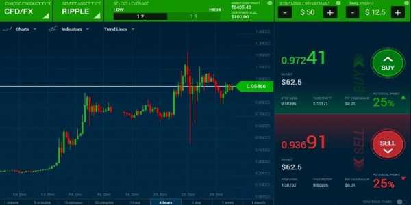
A stock chart is a graphical instrument that displays the market movements at a set time frame, showing whether a stock's value increases or decreases. These graphs help in keeping track of value gains and declines and hence are a crucial aid for stock investors. Stock charts can be easily accessed on numerous financial platforms like Yahoo Finance, Trading View, Google Finance and even on brokerage accounts.

These platforms play a vital role in analysing and comparing stock trends over time, thereby eliminating the guesswork and enabling investors to base their decisions on proven data.
Categories Of Stock Charts And Their Functions
Investors and traders utilise three main types of stock charts:
Line Chart
Over a specified time, a line chart illustrates a series of closing prices with a single continuous line. It is the simplest form of a stock chart. Ideal for beginners, it lays out closing prices and is excellent for spotting general trends. Intraday price data is of no use with this chart.
Bar Chart
Bar charts offer more features compared to line charts. Each bar captures a timeframe, such as daily or weekly, and displays high, low, open, and close prices. This provides a deeper view of price action for those looking for a deeper dive, although it can be overwhelming for beginners.
Candlestick Chart
For their traders, candlestick charts are rich in detail. Each candlestick illustrates the open, close, high, and low prices for a given period, separating bullish and bearish action with colours. Though more advanced, this allows beginners to understand price movement and trends.
Pros And Cons Snapshot For Beginners.
Line charts offer a simple approach to tracking and identifying trends, but provide minimal detail.
Bar charts: These provide more detailed information than other formats, which can sometimes be overwhelming for new users.
Candlestick charts provide a keen overview and are thus the most detailed, favoured by traders, albeit their adoption requires prior knowledge of basic patterns.
Understanding Timeframes In Stock Charts
Like other charts, stock charts show information about price data over a set timeframe, which can range from minutes to months. It always depends on the type of investor:
Intraday charts (1 minute, 5 minutes, hourly): More useful for active day traders.
Daily, weekly and monthly charts: More useful for the buy-and-hold investors who usually look for broader trends over a longer time horizon.
It is equally essential to choose the correct time frame because detailed price movement depends on short time frames. Still, longer timeframes are better for defining price movement in the longer term.

Elements Of a Stock Chart
It is crucial to familiarise oneself with stock charts to track the behaviour of stock prices. These key elements include:
Price Axis (Y-axis): A vertical line displays the price levels.
Time Axis (X-axis): A horizontal line displays the period.
Volume Bars: These display the volume of trading in a given period. Often, high trading volume is associated with strong movements in stock price.
Moving Average Lines: Other key indicators, like 50-day and 200-day moving averages, are used to smooth price fluctuations and help identify trends.
Basics Of Reading Candlestick Patterns
A candlestick chart provides an overview of specific price levels over a set period. It does so by using candlesticks consisting of:
The body shows the price difference between the opening and closing.
The wicks or shadows show the highest and lowest prices.
Green or white candles indicate a bullish candle, as the closing price is greater than the opening price.
Red or black candles mean it is a bearish candle because the closing price is less than < opening price.
Some of the easiest to learn candlestick patterns are:
Doji: Represents stalling of the market.
Bullish Engulfing: A price drop followed by an increase, which could indicate a reversal.
Hammer: Shows a bottoming or price support region.
How To Recognise Trends In Stock Charts
Identifying trends is the very basic of reading a chart:
Uptrend: Has higher highs and higher lows.
Downtrend: Characterised by lower highs and lower lows.
Sideways/Consolidation: Stagnant movement where the price is neither increasing nor decreasing. It shows a period of indecision/rest for the market.
Basic Concepts Of Support And Resistance
Support refers to a price point at which there is a strong interest in buying a stock and does not allow the stock to depreciate further. Resistance is the other side of the coin, where selling interest prevents the stock price from improving further. Marking these areas on the chart will aid in forecasting potential entry and exit zones, which will enhance the accuracy of the buy and sell decisions.
Some Indicators For New Investors
Indicators help better understand the trends and the momentum of a stock. New Investors should start with the following indicators.
Moving Average (MA): Calculates the average price for a specified period to smooth the price fluctuations.
Relative Strength Index (RSI): Calculates the momentum to ascertain overbought and oversold zones.
Moving Average Convergence Divergence (MACD): Displays the two moving averages and their relationship to signal a possible change in trend.
For new investors, it is prudent to start with a few indicators.

Reading Stock Charts: Avoid Common Errors
Beginners often make these errors.
Using a single time frame to analyse the stock and ignoring other time frames.
Disregarding volume as a data point, which helps to price context.
Using a large number of indicators leads to "analysis paralysis"
Attempting to draw patterns on the chart without any market context.
If these mistakes are avoided, better choices and interpretations are possible.
Practical Step-By-Step Stock Chart Analysis Example
Let's take a look at an example with a stock we are all familiar with, Tesla, on a daily candlestick chart:
Choose Timeframe: Use Daily to see long-term trends and patterns, and avoid “noise.”
Spot Trend: Identify whether Tesla is on an uptrend or a downtrend by observing the series of the stock's highs and lows.
Note Support and Resistance: Mark the price levels where Tesla has bounced or been rejected multiple times.
Check Volume and Indicators: Search for confirmatory volume spikes and momentum with RSI or moving averages.
This strategic algorithm reinforces confidence with charting and integrates with other investment studies.
Additional Resources To Enhance Stock Chart Skills
Practice is essential to refine stock chart reading skills, and guidance accelerates the improvement. Yahoo Finance, Google Finance, and TradingView are examples of free online simulators with intuitive charting tools. Video tutorials and books on technical analysis are always a click away. Integrating practice with simulators for paper trading creates a safe environment to test strategies without financial risk.
Stock chart analysis equips you with the tools to navigate the unpredictable territory of the stock market. Like any other skill, regular practice of essential charting tools, timeframes, indicators, and patterns strengthens skills for making precise and accurate investment decisions.